AI Image Aspect Ratios: A Practical Guide for Web, Social, and Video
Choose a shape for composition, enough pixels for delivery, and a crop strategy that survives different screens.
 EzNanoBanana Editorial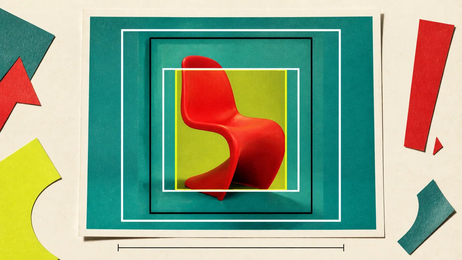
An AI image aspect ratio describes the shape of the canvas, not its sharpness. A 16:9 image is wider than it is tall whether it contains 1,600 × 900 pixels or 3,200 × 1,800 pixels. Choose the ratio from the final placement, choose pixel dimensions from the required display quality, and compose with enough safe space for alternate crops.
That three-part decision is more durable than memorizing a table of platform sizes.
Aspect ratio, dimensions, and resolution are different
Aspect ratio is width divided by height. MDN defines it as the relationship between a box's width and height and notes that images have intrinsic dimensions and a natural ratio (MDN aspect-ratio guidenofollow).
Pixel dimensions are the actual width and height of the file, such as 1,600 × 900.
Display size is how large the image appears in a page, app, or video frame.
File size is the number of bytes transferred. It depends on pixel count, format, compression, and image complexity.
Two images can share a ratio but differ greatly in detail and download cost. Two files can share dimensions but look different because one was heavily compressed or enlarged from a weak source.
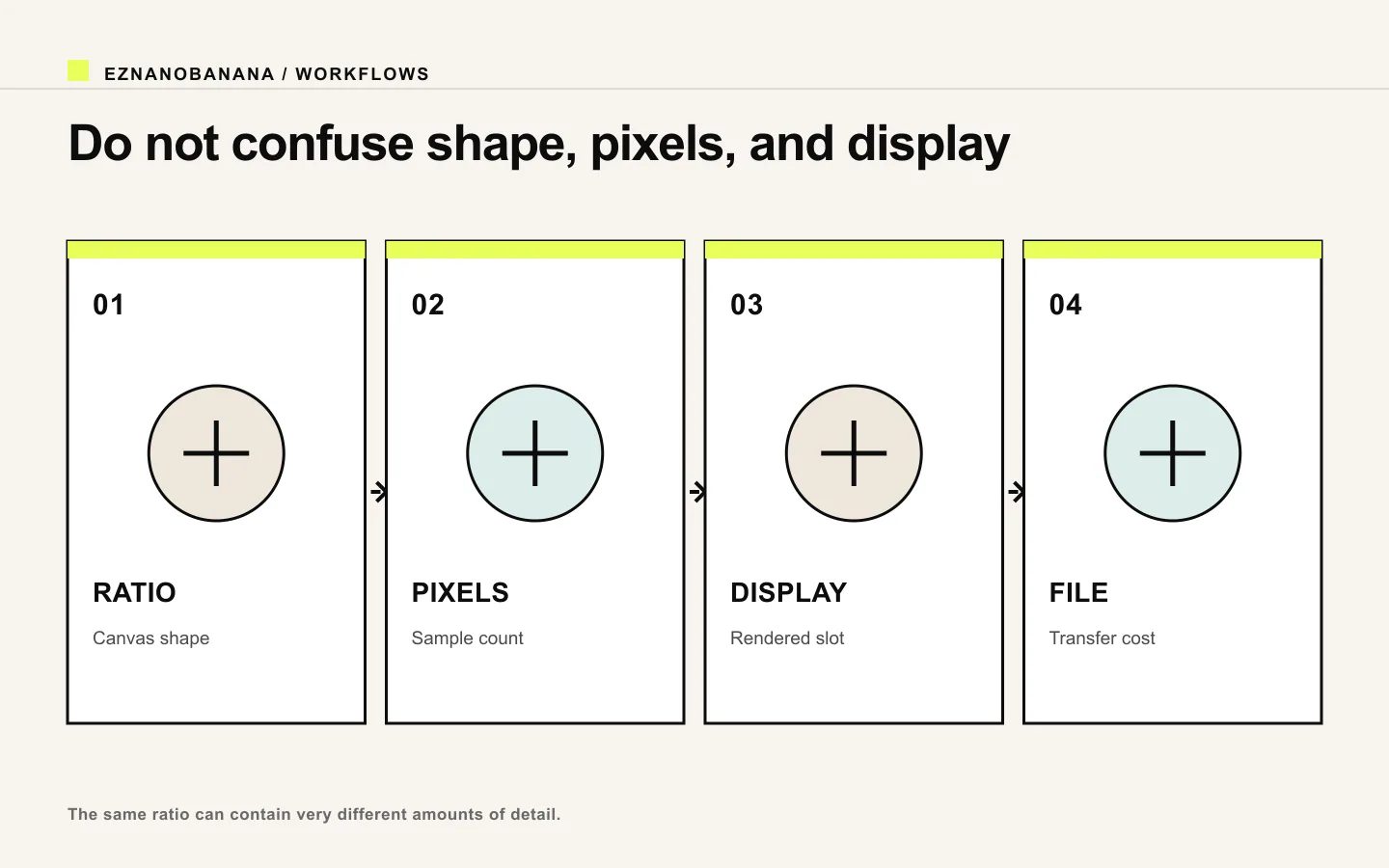 Diagram distinguishing image ratio, pixel dimensions, display size, and file cost.
Use a small set of working ratios
Instead of treating every channel as a unique canvas, build around a few composition families.
1:1 — square
Useful for tiles, avatars, compact cards, and feeds where neither horizontal nor vertical space dominates. It is easy to repurpose but can feel cramped for a full-body subject or wide environment.
Composition tip: keep the focal point near the center and leave breathing room on every side.
4:5 — portrait
A strong choice for vertical feed images, product stories, editorial portraits, and cards that need more height without becoming full-screen vertical.
Composition tip: protect headroom and the lower crop; do not place essential text against the top or bottom edge.
3:2 or 4:3 — photographic landscape
Useful for editorial images, documentation, portfolios, and scenes that need context. These ratios often feel more like a photograph than a banner.
Composition tip: use thirds and environmental depth, but keep the subject large enough to survive a narrower crop.
16:9 — wide
Useful for video frames, presentation visuals, wide article covers, and landscape hero media. It has room for a subject-plus-copy composition.
Composition tip: reserve one side for the focal subject and the other for text, or keep a central action that can tolerate edge trimming.
9:16 — vertical
Useful for full-screen mobile stories and vertical video. It rewards layered depth but is difficult to derive from a wide image after the fact.
Composition tip: arrange important elements along a vertical path and keep key content away from interface-heavy top and bottom areas.
These are starting shapes, not current platform requirements. Check the destination's live specifications before delivery because product interfaces change.
Choose the ratio from the placement
Ask four questions:
- What is the container shape?
- Will text sit beside, over, or outside the image?
- Does the subject move horizontally, vertically, or remain centered?
- Must the image adapt to another placement?
A landscape blog cover with a person at the extreme right may work well if the title sits outside the image. The same composition may fail in a centered square card. If the image must power both, move the person closer to the center and leave recoverable background around them.
For images that may become video, plan the motion path too. A runner moving left to right needs horizontal runway; a rising object or full-body reveal may need vertical space. The image-to-video AI workflow inherits the first frame's composition.
Separate master composition from delivery crops
Create a master that contains all essential information, then define crops for each placement.
MDN distinguishes resolution switching, where the same content is served at different pixel widths, from art direction, where different crops or compositions are used for different layouts (MDN responsive imagesnofollow).
That distinction matters:
- a smaller version of a wide image is still wide;
- a mobile portrait crop may require a different composition;
- automatically trimming both sides can remove the subject or text;
- scaling down does not solve a poor focal hierarchy.
For important pages, design at least a wide and a narrow crop. Use the same art direction, color, and subject, but allow the framing to change.
Build a crop-safe composition
A crop-safe master has three zones:
- critical zone: face, product, action, or meaningful text that must survive;
- support zone: props and environmental context that may be trimmed;
- bleed zone: background texture or atmosphere that can be removed freely.
Keep critical content away from edges. Avoid placing a hand, product cap, or headline exactly on a likely crop boundary. For generated scenes, prompt for extra environment rather than filling every corner with important objects.
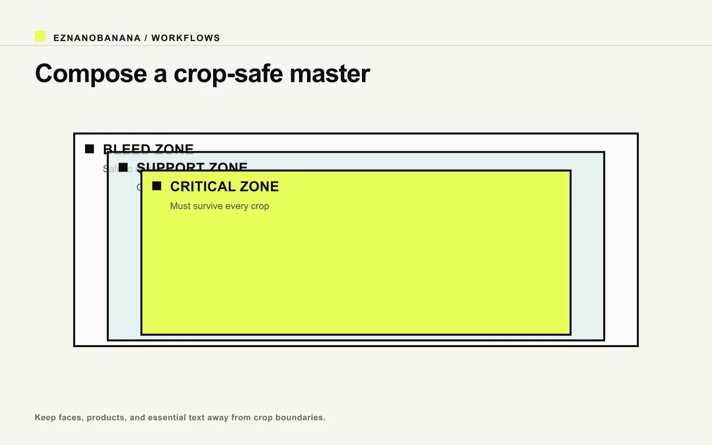 Nested bleed, support, and critical zones for a crop-safe image composition.
A useful prompt line is:
Keep the subject and all defining details inside the central 60% of the frame, with simple extendable background around the edges for alternate crops.
Adjust the percentage based on your placements; it is a composition aid, not a standard.
Choose enough pixels for the rendered slot
If an image displays at 800 CSS pixels wide, a higher-density screen may benefit from a source around twice that width. The browser can choose among candidates when a site provides responsive sources. MDN's picture and srcset documentation explains that selection can account for the rendered slot and device pixel ratio (MDN picture elementnofollow).
Do not interpret this as “always upload the largest possible image.” Oversized sources increase processing and transfer cost. The practical system is:
- keep a high-quality master;
- create appropriately sized variants;
- compress each variant;
- let the delivery layer select a suitable source;
- verify sharpness and crop in the real component.
Your product already plans to use R2 transformations for fetched media, so keep the source master clean and let delivery URLs request fit-for-purpose variants rather than manually embedding one huge file everywhere.
Write aspect ratio into the prompt
Canvas shape influences composition. State both the ratio and how the layout should use it.
Weak:
cinematic 16:9 image
Stronger:
Wide 16:9 editorial scene. Place the product in the right third, keep the left half calm and low-detail for article-title space, and preserve generous background above and below the product for a narrower crop.
For vertical:
9:16 full-screen composition. Keep the dancer's full silhouette inside the central vertical corridor, with open space above the head and below the feet. Layer foreground, subject, and background for depth; no essential detail near the top or bottom interface zones.
Avoid the universal-canvas trap
One source cannot always become a good square, wide banner, and full-screen vertical image. If those placements matter equally, create art-directed variants rather than extreme crops.
Use one shared visual concept:
- same subject or reference;
- same palette and lighting logic;
- same material or illustration treatment;
- different framing and negative-space allocation.
That preserves campaign identity without pretending every container is the same.
A practical preflight checklist
Before generation:
- destination and container identified;
- primary ratio chosen;
- alternate crops listed;
- text placement decided;
- motion direction considered;
- critical zone defined.
Before delivery:
- pixel dimensions suit the rendered slot;
- crop verified on wide and narrow layouts;
- small subject details remain readable;
- file compressed;
- responsive variant or transformation tested;
- no layout shift from missing intrinsic dimensions.
Use the EzNanoBanana AI image generator to create the composition in its primary ratio, but judge the image in the component where it will live. Shape the master for reuse, then deliver the smallest clean variant that preserves the intended crop.
Link policy demo
Standard links remain follow links. Editorial references marked “nofollow” render with a dotted underline and a small policy label, and include rel="nofollow" in the HTML.
Make the next frame