How to Generate Readable Text in AI Images
Improve lettering by reducing text complexity, defining hierarchy, separating copy from art direction, and planning a correction pass.
 EzNanoBanana Editorial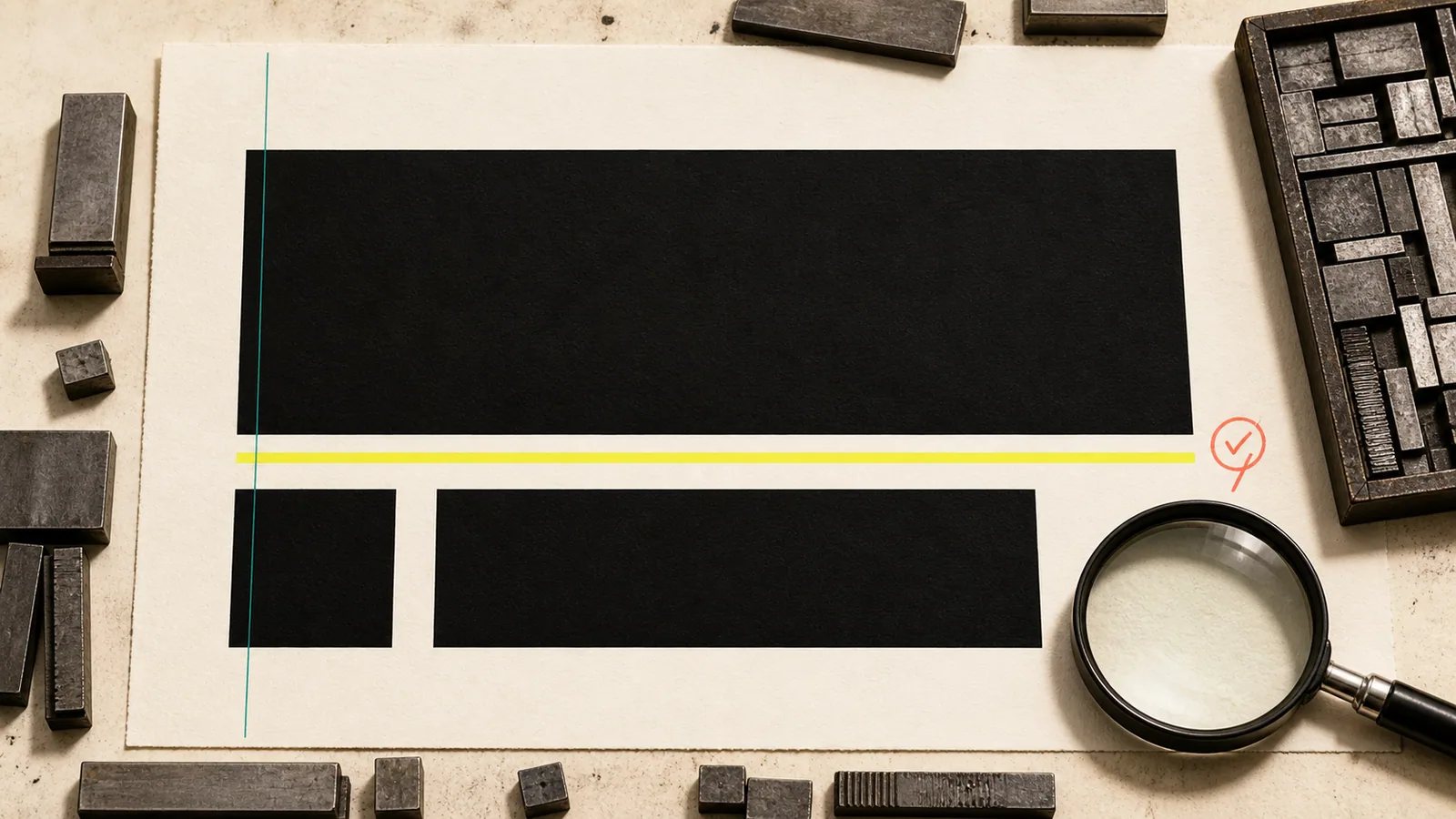
To generate readable text in an AI image, keep the copy short, treat it as a separate specification, define a clear hierarchy and placement, and plan to inspect or correct the result. Modern image models can render text, but a visually convincing poster can still contain a misspelling, merged character, fake punctuation mark, or inconsistent repeated word.
The right mindset is not “ask for a poster.” It is “art-direct an image and validate a text layer.”
Separate copy from art direction
Write the exact copy before you describe the image. Do not bury the words inside a long paragraph.
Use a text specification like this:
- Primary text: “MAKE ROOM”
- Secondary text: “A quiet design conference”
- Date: “OCT 18”
- Priority: primary text first, date second, subtitle third
- Case: uppercase primary and date; sentence case subtitle
- Alignment: flush left
- Maximum lines: two lines for the primary text, one for each secondary block
Then write the visual direction separately: subject, palette, composition, lighting, material, and style.
OpenAI's current image help documentation explicitly includes adding text as a supported kind of instruction, while also allowing later edits through natural language (OpenAI Images helpnofollow). That makes text-in-image work practical, but it does not remove the need for proofreading.
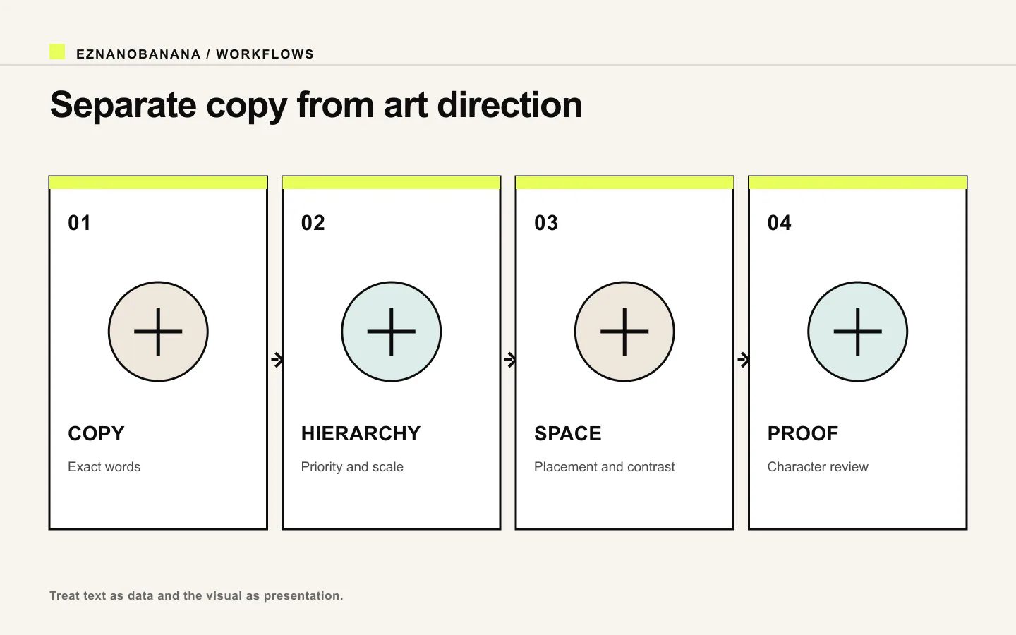 Four-part text-in-image specification covering exact copy, hierarchy, space, and proofreading.
Reduce the amount of text
Every additional word creates more opportunities for errors and more competition for space. AI-generated graphics work best when the text behaves like a headline, label, or compact sign—not a brochure.
Good candidates:
- a two-to-five-word headline;
- a short product or event name;
- one date;
- one price, reviewed carefully;
- a small supporting line.
High-risk candidates:
- paragraphs;
- legal disclaimers;
- menus or schedules;
- multiple prices and product variants;
- exact scientific or medical labels;
- long URLs;
- logos or registered wordmarks that must match precisely.
When all text is essential, generate the visual without text or with a clean empty area, then add the final copy in a design tool. Exact typesetting is not a creative failure; it is the correct production method for accuracy-critical work.
Define hierarchy, placement, and space
A prompt that says “include the title” does not establish design.
Specify:
- where the text block sits;
- how much of the canvas it occupies;
- whether it is one line or several;
- the relationship between headline and supporting text;
- alignment;
- surrounding negative space;
- contrast with the background;
- whether the text overlaps or avoids the subject.
For example:
Place the headline in the upper-left quadrant, flush left, occupying no more than 35% of the image width. Keep the portrait entirely on the right half. Leave clean negative space behind every letter. Use one large headline and one much smaller date; no other text.
Runway's image-prompting guide recommends clear natural language and explicit control over subject, scene, composition, lighting, color, and style (Runway image prompting guidenofollow). For typography, composition is where legibility begins.
Use a text-first prompt template
Create a [format and purpose] with the exact primary text “[COPY]” and secondary text “[COPY]”. Spell and punctuate the text exactly as written. Set the primary text [case, line count, alignment, placement, scale] and the secondary text [relationship to headline]. Use [high-contrast background or text panel] behind the lettering. Keep [subject] in [separate area] with [negative-space rule]. Visual direction: [scene, palette, style, texture]. Include no other letters, numbers, logos, signatures, or watermarks.
Quotation marks help distinguish literal copy from art direction. Repeating the exact copy once in a structured text specification can be useful; repeating it throughout the prompt creates more ambiguity.
Generate one text block at a time
If a composition needs a headline, date, location, price, and three labels, do not begin with all five.
A safer sequence is:
- generate the composition with the primary headline;
- choose the version with correct copy and clean space;
- add or edit one secondary block;
- proofread again;
- typeset any remaining accuracy-critical details manually.
This also makes failures diagnosable. If the headline is correct but the date is wrong, you can repair the date region instead of rerolling the whole poster.
Three practical prompt examples
Editorial poster
Create a vertical editorial poster with the exact headline “MAKE ROOM” in two large uppercase lines. Set it flush left in the upper-left area with wide tracking and strong contrast. Place a small exact date “OCT 18” below it. Keep a sculptural red chair on the lower-right, with clear empty off-white paper behind the text. Restrained Swiss editorial composition, charcoal ink, warm red accent, subtle paper grain. Include no other text, logos, or signatures.
Product announcement
Create a wide product announcement image with the exact headline “A SMALLER SIGNAL” on one line and the exact supporting text “Meet Pico” below it. Place both in a clean dark panel on the left third. The compact silver speaker occupies the right half, photographed with soft rim light on a midnight-blue background. High contrast, minimal technology editorial. No invented labels or interface text.
Album-style graphic
Create a square experimental music graphic with the exact title “AFTER RAIN” in uppercase at the bottom center. Use one line only, simple condensed lettering, pale cream against a deep green field. Above it, show an abstract wet-glass texture with a small amber light. No artist name, no extra letters, no symbols that resemble type.
Choose typography by behavior, not brand name
Instead of asking for a specific commercial font, describe visible qualities:
- condensed or wide;
- geometric or humanist;
- high-contrast serif or plain sans;
- monospaced;
- rounded terminals;
- heavy display weight;
- loose or tight tracking;
- uniform stroke or calligraphic variation.
This produces a direction without implying exact font reproduction. If brand typography must be exact, generate the artwork with reserved space and apply the actual licensed font afterward.
Proofread at the final display size
Review in two passes.
At 100% zoom, check:
- every letter and numeral;
- punctuation and apostrophes;
- repeated words;
- consistent baseline and spacing;
- accidental extra glyphs;
- text-like marks in the background;
- distorted logos or package labels.
At delivery size, check:
- contrast;
- hierarchy;
- line breaks;
- text-to-background separation;
- whether small copy remains useful.
A browser may serve different image candidates for different screens, and the rendered slot can be much smaller than the source. MDN's responsive-images guide explains that source selection depends on layout and device conditions (MDN responsive imagesnofollow). Legibility must therefore be tested where the image will actually appear.
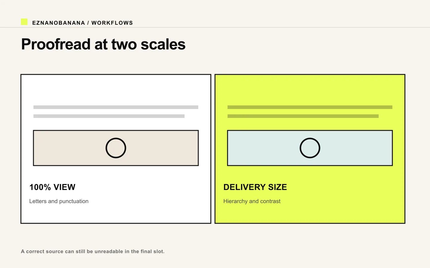 Two-scale proofreading comparison between 100 percent view and final delivery size.
Fix text without losing a good image
If the art is strong and one word is wrong:
- select or mask only the text area;
- restate the exact copy;
- preserve subject, composition, palette, and all other text;
- keep the same alignment, size, and line count;
- generate several repair candidates;
- compare character by character.
If repeated repair changes the layout, remove the faulty text area and typeset manually. Do not sacrifice a strong, approved image to endless full-canvas regeneration.
Use the right production boundary
AI-rendered text is useful when lettering is part of the visual idea: hand-painted signs, stitched words, dimensional type, poster experiments, playful packaging concepts, or editorial covers.
Use conventional typesetting when the text carries contractual truth: price, dosage, legal copy, product specifications, logo, trademark, URL, or accessibility-critical information.
To test a concise text-led concept, use the EzNanoBanana AI image generator. Start with one short headline, reserve clean space for it, and approve the words before adding any secondary copy.
Link policy demo
Standard links remain follow links. Editorial references marked “nofollow” render with a dotted underline and a small policy label, and include rel="nofollow" in the HTML.
Make the next frame